In the last couple of weeks, an eye problem (all is good now, phew) got a little bit in the way of normal life, so this post is a bit shorter than usual.
My thoughts have continued to revolve around my various house projects, and now that the wallpaper in my showroom is hung and the walls are painted, the fun part of "accessorising" has begun! A decorating project is not dissimilar to putting an outfit together, only that furniture, fabrics and decoration objects are more permanent and so a lot more thought goes into the process.
To me, it is very important to feel objects, be it furniture or fabrics, and see their dimensions, textures and characteristics in real life. However, in times of Covid travel is a rare event, which makes the process of sourcing more difficult and time-consuming. I'm making good progress nevertheless and have amassed a beautiful collection of fabric samples, both for my decoration projects and the expansion of my bag insert line. I've also compiled a list with some furniture options which I'll finalize when next in London.
A trip earlier this month to Isle-sur-la-Sorgue (a pretty provençal town that is home to numerous antique shops, fairs and markets) was great fun, even though I didn't find the kind of things I was looking for. The picturesque scenes and romantic settings more than made up for it, and the trip was worthwhile nonetheless.

The fabric inspiration for the showroom entrance goes many years back, when DH and I were walking down the Rue du Mail in Paris (where many of the major Éditeurs de Tissue/fabric houses are located). We both stopped in our tracks at the sight of some beautiful panels of printed, tabby weave linen fabrics in a shop window.
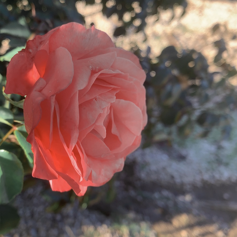
I've never forgotten them and now, many years later, I thought that the large-scale design of paradise birds perched on leafy branches would go perfectly with the newly hung wallpaper. I ordered samples of most of the CWs to try them in combination with the room. My favourites turned out to be the dusty pink, emerald green, and beige. To see how they work with the walls, why not drape them like a shawl? Let me know which one you like best!
Option 1: emerald green with deep salmon coloured flower accents (CA1491/030)


Furniture and accessory ideas to go with the green option


Option 2 - neutral in beige, cream and brown (CA1491/20)


The picture below is of one of the many horses that I encounter when walking the dogs. Thanks to the comments on Instagram I now know that its beautiful espresso/white colored is called "roan". To see more pictures of the horse click here


Option 3 - Pink with golden flower accents (CA1491/060)

The table and carver chair from the first option would work very well in the pink scheme, too. Here with playful Chinoiserie vases instead of the green ones.


In the meantime, my big mirror arrived but unfortunately, with broken glass. For safety reasons we removed all the glass and it looked so mysterious and beautiful that I almost wanted to keep it that way.

In the end, the replacement arrived and I could not be happier as I love how it reflects the trees on the wall.

Hope you are safe and well, and enjoying a beautiful and happy autumn xxx
Fabric: Avventura by Chivasso (through JAB Anstoetz)
Gorgeous fabric. Is it available in the US? I think I like the green and roan the best.
ReplyDeleteHello dear Andee!
DeleteSo nice to hear from you, hope all is well! The fabric distributor has a showroom in NYC:
JAB USA INC.
979 Third Ave. D&D Building, Suite 102
New York, NY 10022
Phone: 212–486–1500
E-mail: info@jab.us
Many thanks also for voting, we start the score with Green (1) Beige (1) Pink (0)
Much love,
Tai xxx
Your photographs as very beautiful, as always. Since you asked... my first choice would be the green fabric, with pink a very close second. Cannot wait to see which you choose!
ReplyDeleteThanks so much for voting! The current score is:
DeleteGreen (2) Beige (1) Pink (1)
I am so excited to share the process with you, this is so much fun xxx
Option 3 - the pink!
ReplyDeleteMany thanks for voting, Mary Louise!
DeleteNew score:
Green (2) Beige (1) Pink (2)
Gosh, it's all gorgeous but I'd have chosen the emerald green if it hadn't been for the beautiful chinoiserie vases and the dusty pink would accentuate the wallpaper rather than "take away" from it. Spoilt for choice though, aren't you? Lucky lady 🌺🌸💮🌿🌳🦜
ReplyDeleteNo doubt about it: the green.💚
ReplyDeleteI like the pink.
ReplyDeleteThe pink had a slow start, but it's catching up ... Many thanks for voting!
DeleteGreen (2) Beige (1) Pink (3)
I vote pink!!
ReplyDeletePink is leading the pack, many thanks for voting Anne!
DeleteGreen (2) Beige (1) Pink (4)
All are lovely but, to my mind, the pink option is the most elegant and pretty choice!
ReplyDeleteThanks so much, happy you like them all! Pink is now clearly in the lead:
DeleteGreen (2) Beige (1) Pink (5)
Ooooh I love the green! My favorite color. I'm following the progress-it's going to be gorgeous and your photos are fabulous!
ReplyDeleteThanks so much pegnek, glad the green got another vote!
DeleteCurrent score: Green (3) Beige (1) Pink (5)
I adore the green - at once lush but soothing. The pink is very pretty mind you. I love the neutral too and the little roan pony making another cameo appearance! The green has it by a whisper.
ReplyDeleteThanks so much for the kind words, dear Redpuglover! I couldn't resist "smuggling" the sweet roan into this post and am so happy that you like the fabrics. "Lush and soothing" brought Green closer to pink, it's a tight race again!
DeleteGreen (4) Beige (1) Pink (5)
GREEN OR PINK IS MY INPUT!
ReplyDeleteLOVE THAT PROVENCAL TOWN..............ISLE OF SORG as I CALL IT as I DONOT SPEAK FRENCH!BEEN A FEW TIMES OVER THE PAST 30 YEARS................NEVER DISAPPOINTS!
XX
I will call it Isle of Sorg from now on, dearest Contessa! Please let me know when you come next, it would be such fun to meet there. Many thanks for voting, green and pink are clearly in the lead!
DeleteGreen (5) Beige (1) Pink (6)
The pink is lovely (especially draped around your shoulders), but I cast my vote for the green. It's more of a continuous feel and the salmon accent color is gorgeous. And is that other color in the green material an evergreen, deep blue green, or deep blue in the leaves? What a nice color to pick up in accents in the fall and winter and use the salmon color as spring and summer accents. What a tight vote between the green and pink!
ReplyDeleteWarm hugs,
CS
Dear CS, - thanks so much for your kind words and for sharing your thoughts! The green fabric contains all the shades of green/blue you mentioned, and the salmon color is a magnificent accent indeed. Perfect for color scheming, as you said! Many thanks for your vote, which has put the green into a tie with pink! -> Green (6) Beige (1) Pink (6) Warm hugs and have a fabulous autumn, Tai x
DeleteMost comments arrive by email these days, but since the ones concerning this post also contain votes, I am copying them below in the order I received them (for privacy reasons the names are shortened to initials).
ReplyDelete1)
The Green!!!!!
Sent from my iPad
M.B.
-> Green (7) Beige (1) Pink (6)
2)
Hi. Your Iksel Italian Panoramic is my top choice for my new house! I’m crazy love it. I prefer #1 but think #2 can blend more with other elements and offer additional color choices for accessories.
L.F.H.
-> Green (7) Beige (2) Pink (6)
3)
I love the emerald green with the salmon colored flowers! The pink example would be my second choice. I love the impact of color! Good luck!��S.W.
Sent from my iPhone
-> Green (8) Beige (2) Pink (6)
4)
Hello dearest Darling Tai! Wow, just wow! I’ve been quite excited about your new project since you last mentioned it, and these photos do help address my longing, hahah. I must say all three CWs are exquisite, but if it’s an assignment that everyone has to decide on only one, then the emerald green ���� Sorry to hear that you had an eye problem but good to know that all is good now. Please take good care C.Y.
-> Green (9) Beige (2) Pink (6)
5)
The emerald green is so stunning and elegant I pick this one.
E. & J. O’B.
-> Green (10) Beige (2) Pink (6)
6)
My vote- the Dusty pink, Emerald green both are hits - enhance the background - Perhaps both could be used in some way in your space.
The beige deadens everything. It stops motion, creativity, and thematic progression, whereas the other two bring the background to life thematically, stylistically and with their colors…
…since you invited an opinion.
Thanks my take.
Good luck!
J.E.
-> Green (11) Beige (2) Pink (7)
7)
The one I like the best is:
Option 1: emerald green with deep salmon coloured flower accents (CA1491/030)
Cecilia
-> Green (12) Beige (2) Pink (7)
8)
All tough choices. Look forward to seeing the final result
C.D.
9)
ALL my favorite colors and neutrals. Just beautiful.
A.G.
10)
I loved Option 1 but then when I scrolled down and saw Option 3, I feel in love. It really popped against the wallpaper. Can’t wait to see which one you decide on.
Good luck.
Regards,
E.A.
-> Green (12) Beige (2) Pink (8)
11)
Option #1.
Sent from my iPhone
B.S.
-> Green (13) Beige (2) Pink (8)
12)
3 complements both you and the wallpaper
Everything is shaping up beautifully!
N.A.
-> Green (13) Beige (2) Pink (9)
13)
Definitely the PINK material.
Why? It enhances every woman’s skin. It never looks bland. It brings out the green.
Pink becomes every person, even men.
Pink energizes the cognitive workings of the brain.
None of the others even come close.
Affectionately,
S.S.
-> Green (13) Beige (2) Pink (10)
Continuing ...
ReplyDelete14)
Thank you for sharing these beautiful images!
E.S.
15)
The green without a doubt!
Sent from my iPad
E.B.
-> Green (14) Beige (2) Pink (10)
16)
Thank you so much for sharing this beautiful post!
I personally adore the pink option. Can’t wait to see which one you have chosen!
Hope your eye problems are sorted out (I had a nasty issue with torn retina too, at the beginning at the first lockdown, and am keeping an eye on my BP now).
Best wishes
K.B.
-> Green (14) Beige (2) Pink (11)
17)
I like the pink best. I think the neutral washes you out and is not very interesting in its own right.
D.K.
-> Green (14) Beige (2) Pink (12)
18)
Lovely shop front! Where is it? I’d opt for the green fabric. I love the pink but the green would go better in that exquisite setting!
S.C.
-> Green (15) Beige (2) Pink (12)
19)
Hello,
I prefer the pink scheme :)
May I kindly ask you from where you got the chair?
Many thanks and best kind regards,
C.C.
-> Green (15) Beige (2) Pink (13)
20)
Dusty pink for sure green is too ton sur ton and beige is too colorless
Z.I.
-> Green (15) Beige (2) Pink (14)
21)
Definitely the emerald green with the deep salmon.
What gorgeous settings!
S.S.
-> Green (16) Beige (2) Pink (14)
22)
Green, although not my color is fabulous, followed by the pink.
BonNe Continuation!
M. F.
-> Green (17) Beige (2) Pink (15)
23)
Hello there!
Well, this is very exciting and fabulous!
I think the beige because you can add different colours and it’s soft and relaxing.
Have a look on Instagram under velvetandlinen (Patina Farm). There are quite a few photos of her farm animals now so you may have to scroll down a bit). She has beige everywhere and it’s gorgeous. Her husband is a wonderful architect. They have an Instagram online shop ‘giannettihome’.
Best of luck! Exciting times for you! 🌹
T.
ps.. all your colours are lovely so it wouldn’t matter what you choose. ♥️
-> Green (17) Beige (3) Pink (15)
This is very interesting - my preferences would be 1) green 2) pink 3) beige. Please do let us know your final choice ! Many thanks
ReplyDeleteHappy you like them all, many thanks for voting! Will definitely report on the final choice. Might be a bit of time, as I want to get the furniture first and then see how the space feels.
Delete-> Green (18) Beige (8) Pink (16)
I've returned to check the tally of the votes to see which color has the lead. They are all very nice in their own way. I'm still very fond of the green for the reasons mentioned above, but after studying photo #16 and how the location of the windows relate to the wallpaper, I think roan would also be a very good option as it would let the wallpaper take center stage and fade into the background. It's a tough decision, dear MaiTai, but as you have often said when choosing scarves, choose the one that makes your heart sing.
ReplyDeleteWarm hugs,
CS
P.S. I'm going through the same here at my home. It can be maddening at times. lol
How nice to see you checking back, dear CS! I can see all three of them working very well, each one lending to a different atmosphere. Happy that beige got another vote (I think the lovely roan pony is helping), so the new tally is: > Green (18) Beige (9) Pink (16)
DeleteBest of luck with your own project!
Dear MaiTai,
ReplyDeletesorry for my late reply, but due to a little time out in the mountains (COVID compliant of course) I have read your post today. I am very sorry that you had a health problem and I wish you continued recovery for it!
Now to your question: I like green best, closely followed by pink.
Alles Liebe von Claudia
Dearest Claudia, - hope you had a wonderful time in the mountains! A trip is something so special and exciting these days. So happy you joined the voting party, thanks so much!
Delete-> Green (19) Beige (9) Pink (17)
PS. The eye is fine again, but will have to leave out the lenses for another week. So happy all is good!
Oh Maitai..
ReplyDeleteYou are killing me... I miss the south of France so much and Isle sur la Sorgue, as you remind me, is such a treat for the eyes. My mother lives not very far (Roussillon) and my aunt lives in Saignon. Looking at your pictures, I could smell the Luberon and it looks like you are enjoying a beautiful arriere-saison. But I digress: I love your new wallpaper, much like a modern day sfumato. Your mirror is superb avec ou sans glass panel. My vote goes for option number 1. Thank you for sharing your new project. Best, Beatrice
Dear Beatrice, - so lovely to know that the post evoked memories of times spent with your family in the South of France, hope you can visit them, and the Isle sur la Sorgue soon again! Thanks so much for your vote, and kind words regarding the new wallpaper and mirror ... so happy you like them! All the best xx
Delete-> Green (20) Beige (9) Pink (17)
:-) Dear MaiTai,
ReplyDeleteall of the suggestions are lovely. My favorites are pink, green and beige - in that order.
Hope you are feeling better?!
Take care and have a very HAPPY November,
Claudia :-)
Dear Claudia, - thanks so much for voting and your kind words. The eye is fine and needs just a little more rest! I added all of your three favorites to tally, which now stands at: Green (21) Beige (10) Pink (18)
DeleteHave a happy, cosy and beautiful November too! Alles Liebe, Taina
Dearest Tai,
ReplyDeleteWe came from Paris yesterday, after a wonderful week which will help me cheer up in Winter’s darker days.
It was so nice!!!
My choice of fabric is green or pink.
Looking forward to hearing what you chose.
Have a great Sunday and a great holiday tomorrow.
Much love,
Manuela
Dearest Manuela,
DeleteHope you had a most wonderful, fun and fabulous time in Paris!! The weather must have been pretty good, but then again Paris is even beautiful in the rain.
Thanks so much for voting, I've added both your favorites to the list. We now have:
Green (22) Beige (10) Pink (19)
Hope you had a relaxing bank holiday today, another one is right around the corner!
Much love, Tai xx
Dearest Taina,
ReplyDeletehope your recovery is proceeding well, I truely enjoy your beautiful photos of the Isle-sur-la- Sorgue and of the progress of your interior styling project.
Concerning the colour-choice I prefer pink, because beige looks rather boring imo, green seems to matchy with the wallpaper imo, pink is a very subtle contrast, which allows though a lot of variability in decoration. I know the Jab Anstoetz tissues well and you won't be disappointed by the quality whatever choice you do.
I'm curiously waiting for the presentation of your new show room
liebe Grüße U.
My dear U, - thanks so much for the lovely comment, I am so happy that you enjoyed the little trip to the Isle-sur-la-Sorgue! I love the quality of JAB Anstoetz too, and have used them for years for some of the solid colored fabrics for my inserts. The showroom project takes soooo long, hope everyone is not loosing their patience! Delivery times for everything are insanely delayed.. Ganz liebe Grüsse! PS. Thanks for voting, the score is Green (22) Beige (10) Pink (20)
DeleteIf you're still taking votes, I love the green! And I think yes that pony/horse is some sort of Roan. Roans come in different colors, &, as others have said, there are also Grullas, Duns, & Buckskins that have dark manes like that, & may have a dark stripe down their back--as I recall, the dark stripe on the back is what makes the difference. So, yes, could be a Bay To an or Chocolate Roan or maybe a Grulla or Dun if he/she has a dark stripe on their back.
ReplyDeleteIf you're still taking votes, I love the green! And I think yes that pony/horse is some sort of Roan. Roans come in different colors, &, as others have said, there are also Grullas, Duns, & Buckskins that have dark manes like that, & may have a dark stripe down their back--as I recall, the dark stripe on the back is what makes the difference. So, yes, could be a Bay Roan or Chocolate Roan or maybe a Grulla or Dun if he/she has a dark stripe on their back.
ReplyDeleteOf course I still take votes, my apologies for the late reply though! So happy that the sweet pony is confirmed as a Roan, as I am so fascinated by its beautiful coat. It doesn't have a dark stripe on its back, so I'll call her Bayto or Chocolate from now on ;) Thank you also for voting, the new score is Green (23) Beige (10) Pink (20)
ReplyDeleteFinal score!
ReplyDeleteGreen is the clear winner amongst the blog comment votes: Green (23) Beige (10) Pink (20)
However, on Instagram and Facebook Pink has been the favorite:
Instagram: Pink 121 - Green 66 - Beige 0
Facebook: Pink 44 - Green 14 - Beige 0
Total score: Pink 185 - Green 103 - Beige 10
This has been great fun, thanks so much for voting and for your comments everyone!
Will continue to share the progress xxx